The client already had a Wix website, a logo, and a defined service offering. What was missing was a digital experience that felt specific to the brand and strong enough to support a paid consultation model.
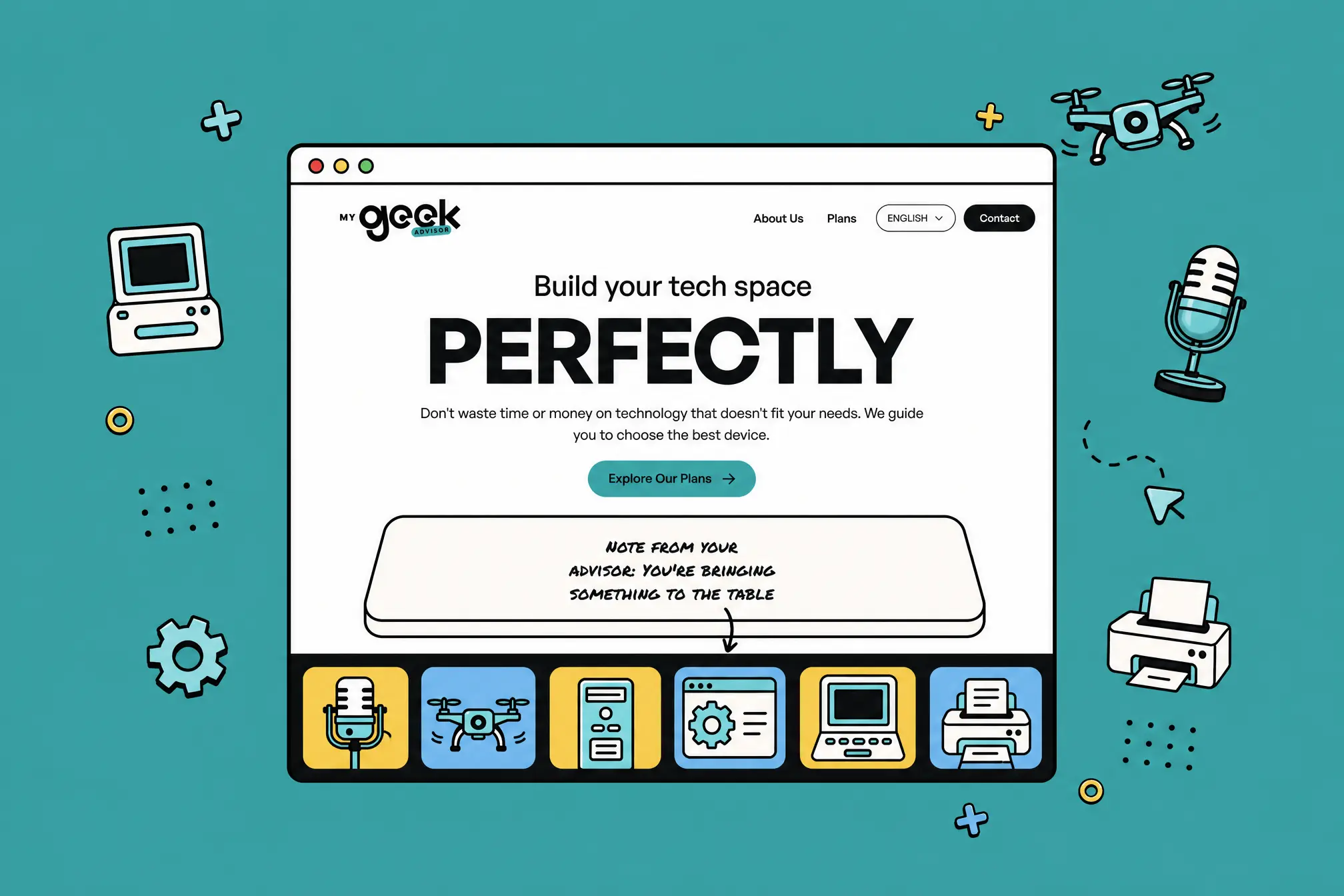
From the beginning, the challenge was strategic as much as visual. My Geek Advisor needed to feel trustworthy enough for users to pay and book, but still personal enough to reflect the brand. The existing logo pointed toward that balance: formal enough for technology consulting, playful enough to feel approachable and memorable.
Starting from the real business need
The service was already clear: help people make better technology purchases through personalized advice. The plans covered different user types, from students and home users to creators, gamers, streamers, podcasters, and people planning a custom PC build.
That meant the website had to do more than describe consulting. It needed to help visitors recognize themselves quickly, understand which plan matched their situation, and move from interest to payment without unnecessary steps.
The design decision that shaped the experience
Most service websites use a browse-first, book-later model. For My Geek Advisor, we designed around a pay-first flow: understand the offer, choose a consultation plan, complete payment through Stripe, and then schedule the call through Calendly.
This reduced ambiguity and filtered for higher-intent users. Instead of sending people into an open-ended contact form, the website guided them toward a defined commitment: select the advisory support they need and reserve a real consultation.
Visual direction: credible, playful, and personal
The visual direction came from interpreting the brand rather than forcing a generic tech aesthetic. The logo already suggested a mix of structure and personality, so the interface leaned into a soft neomorphic visual language with bold lines, energetic colors, and custom assets.
That balance mattered. Upfront payment requires trust, but the service itself is personal and advisory. The design had to feel reliable, clear, and organized while still showing enough character to make My Geek Advisor feel like a real guide, not a faceless tech company.
Making the service feel tangible
One of the most important interaction ideas was a drag-and-drop product table. Instead of only explaining that the advisor helps users choose the right products, the interaction turned that idea into a visual metaphor: arranging the tools, devices, and setup pieces that fit the user's needs.
The goal was not to add motion for decoration. It was to make the advisory value easier to understand and to pull users into the experience before asking them to choose a plan.
Why Astro
The final build did not need the overhead of a full application. It needed a fast, polished, content-driven website with enough custom front-end control to support micro-interactions, technical SEO, responsive layouts, and a smooth payment-to-booking journey.
Astro kept the site lightweight while allowing a fully custom implementation with Tailwind CSS, GSAP interactions, custom assets, Stripe, and Calendly.
Results
The site launched as a custom, responsive web experience with a clearer path from service discovery to paid consultation. Across key pages, Lighthouse scores reflected the technical priorities behind the build:
Performance: 92-97
Accessibility: 95-100
Technical SEO: 100
Collaboration
The collaboration with the client was direct and productive. I proposed visual and interaction ideas, and he responded with feedback grounded in how he understood his own brand. That dynamic helped the project avoid a generic template feeling and pushed the final site toward something more specific: clear, practical, and still full of personality.
We also made a deliberate decision not to overload the site with unnecessary information. The service needed clarity more than volume. Each section had to help the user understand the offer, compare plans, trust the advisor, and move to the next step.
Reflection
The strongest lesson from this project was that a conversion-focused website does not have to feel cold or generic. For My Geek Advisor, the best decisions came from combining clarity with personality: a simple funnel, a trustworthy payment flow, custom visual assets, and interaction that made the advisory service easier to understand.
If I revisited the project, I would explore stronger visual differentiation between plans and more post-launch conversion tracking. The foundation is strong, but deeper analytics would make it easier to refine the relationship between plan presentation, user intent, and completed bookings.
I interviewed a lot of people before talking to you, and I chose you because I knew you wouldn't give me the runaround. You knew how to take all my ideas and run with them. You were the fastest to deliver.
Juan Zamorano, CEO, My Geek Advisor