Lace
UX and UI Design | Case study
- Role
- UX and UI Designer
- Responsibilities
- Conduct user research, interviews, journey mapping, usability testing, wireframing, low- and high-fidelity prototyping, design iteration
Heading to my universe...David Langarica © 2026
UX and UI Design | Case study
UX/UI case study for a simpler clothing e-commerce app.
UX/UI case study for Lace — a clothing e-commerce app. Covers research, wireframes, low-fi prototyping, and usability testing by David Langarica.
The goal was to design a clothing app that made it easier for users to browse, compare, and temporarily reserve items before purchase.
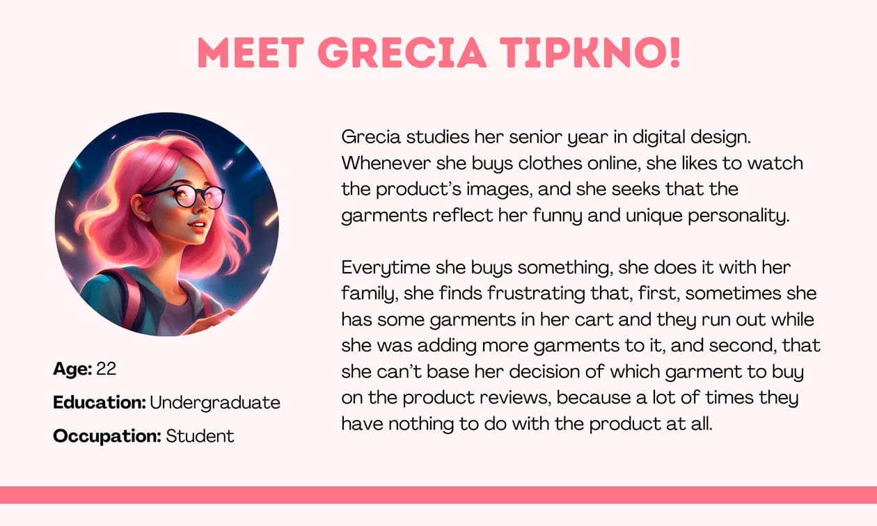
User interviews helped surface the real concerns behind clothing purchases: size uncertainty, trust in reviews, stock availability, and hesitation before checkout. Those insights shaped the core flow of the app more than the original assumption about cart expiration alone.
I started with paper wireframes to explore different ways of surfacing the most useful shopping actions. I combined the strongest ideas into one streamlined layout focused on browsing, product confidence, and temporary item reservation.
After refining the wireframes, I built digital versions and incorporated feedback from usability testing. I also added an in-context confirmation message so users could see immediately when an item had been successfully put on hold.
I then created a low-fidelity prototype to test the path from browsing to order confirmation and identify friction before moving into higher fidelity.
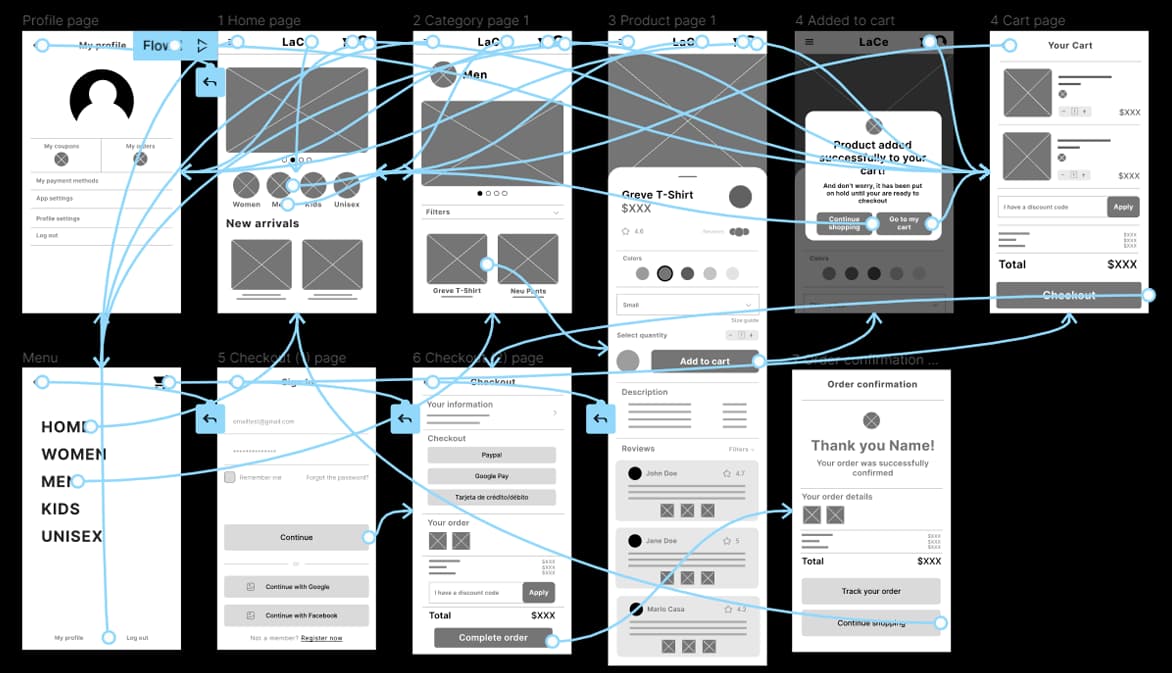
I ran two rounds of usability testing with five participants. The first round surfaced three main issues: users wanted product subcategories, the cart icon felt unclear for a fashion context, and reviews needed more credibility. The second round showed that users also wanted to know how long an item would stay reserved and felt the toolbar consumed too much screen space.
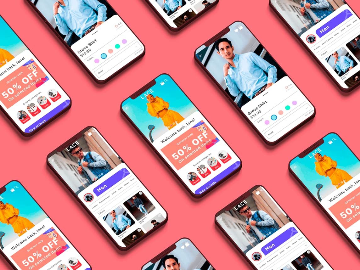
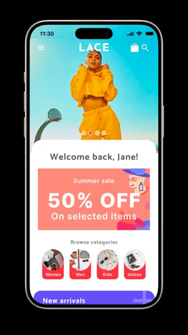
I used the study findings to simplify the interface, improve visual hierarchy, and make the shopping flow feel more intuitive. I also began translating the wireframes into polished mockups by adding color, imagery, and iconography where it helped support comprehension.
The main design adjustments focused on clarifying product categories, reducing toolbar clutter, and making the reservation status more visible during the shopping flow.
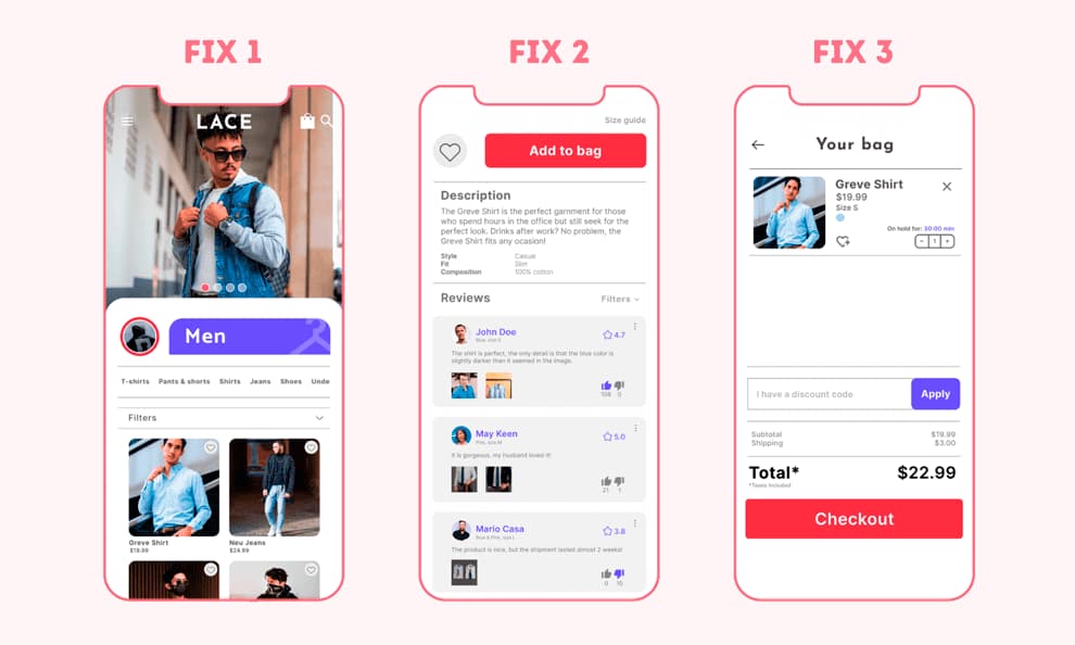
After the final iteration round, I completed the high-fidelity prototype. The final design kept the same core flow but improved clarity, visual consistency, and confidence at each step of the purchase process.
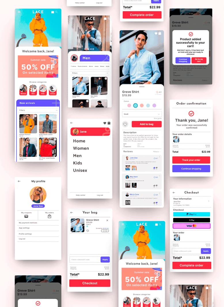
Accessibility considerations included clear iconography, sufficient text contrast, and enough spacing to keep the interface easy to scan. The goal was to make the app understandable and comfortable to use across different screen sizes and reading conditions.
Lace showed the value of designing around user hesitation, not just user action. The next step would be to refine sizing support, improve trust around fit and reviews, and test whether a try-before-you-buy flow would better serve users.
Refine sizing guidance so users can compare fit more confidently before committing to a purchase.
Improve trust around fit, product expectations, and reviews, then test whether a try-before-you-buy flow would better serve users.
This project reinforced the importance of designing from real user concerns rather than assumptions. It also sharpened my process for turning research findings into practical interface decisions.
