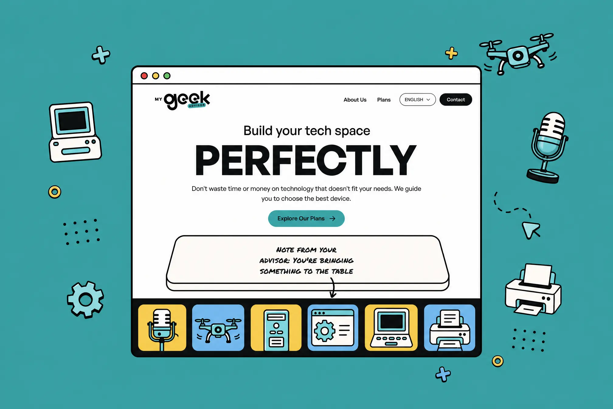
The design decision that drove everything
Most service websites let users browse, book a free call, and hope to convert later. We did the opposite. The entire site was designed around a pay-first flow: understand the offer, choose a plan, commit financially, then unlock scheduling through Stripe into Calendly.
No ambiguity. No tire-kickers. No wasted time. Just a clear path from interest to paid consultation.
Visual direction
The site needed to feel trustworthy enough that paying upfront felt natural rather than risky. Playful and colorful to catch attention, but guided and purposeful enough to move users toward a decision. Every visual choice served that behavior — nothing existed for decoration alone.
Why Astro
The client didn't need an app. He needed a fast, polished, content-driven sales machine. Using something heavier would have been overengineering. Astro meant the site could feel custom and premium while staying lightweight, SEO-ready, and low-maintenance. The adult choice, not the flashy one.
Results
Lighthouse scores across all pages:
Performance: 92–97
Accessibility: 95–100
Tech SEO: 100
What the client said
I interviewed a lot of people before talking to you — and I chose you because I knew you wouldn't give me the runaround. You knew how to take all my ideas and run with them. You were the fastest to deliver.
— Founder, My Geek Advisor
Reflection
The biggest takeaway is that clarity converts better than creativity alone. It's tempting to over-design or add complexity to make a project feel premium. But here, the real leverage was in the structure — reducing friction and making every decision obvious. If I did this again, I'd push even harder on differentiating the plans visually so users self-select faster.